Here's a very straightforward graph to help explain why Americans are so glum, and angry.
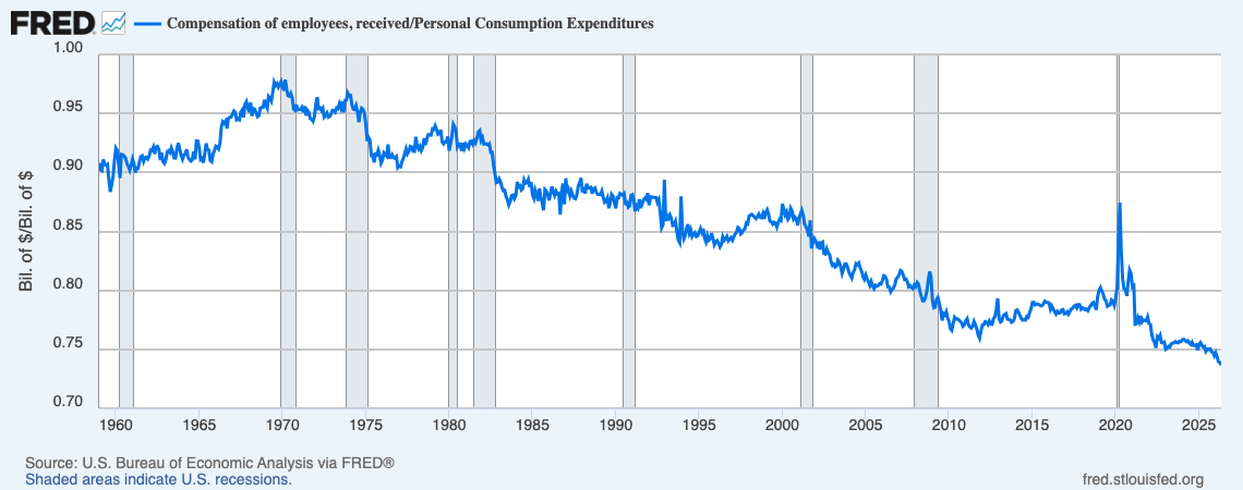
A simple interpretation of the graph is that until 1982, the "average" American household could afford more than 90% of average consumption out of labor income alone. You didn't need hereditary asset wealth, some accumulated chunk of savings, to lead an average life. You could just get a fucking job — an average fucking job, not some amazing "career" position you sucked dicks your whole life to qualify for — and your family could live something close to a full, normal American life with your head held high.
By 2010, the "average" American household could afford less than 80% of average consumption from labor income alone. That's not a full, normal, American life, but a substandard life, a lifestyle of losers. In the current era, a household needs either property wealth and income or someone with an extraordinary job to support full, normal lives. A household of people with average jobs and no other income now affords less than 75% of average consumption.
You can nitpick this interpretation. A substantial fraction of US households include no employed people. So, conditional on anybody working, labor income may provide close to 90% of the average! Whatever. The information is not in the absolute numbers, but in the rather shocking decline in labor income relative to the consumption that defines a normal life.
Discussions like this always devolve to questions of the average versus the median. Both compensation and consumption are "right skewed" — the average will be higher than the median. Maybe what the median, often taken to mean "typical", worker earns would not have declined so much relative to median, "typical", consumption?
But what "average consumption" is a proxy for here is the consumption that defines living "a full, normal American life with your head held high". The definition of a "full, normal" life is not a typical life, unless one presumes that "full, normal lives" are in fact typical. This essay is an attempt to explain the apparent opposite, that it is increasingly common for people to lead economic lives they do not consider full. An unhappy life might be normal in the sense of "common", but not at all normal in the sense of meeting society's norms about how a life is successfully led.
Norms about what constitutes a "normal" life in America are set by the upper middle class. Americans don't feel like losers because they can't live like Elon Musk lives. But they feel like losers if they don't have ready access to high-quality health care, if their schools aren't safe and solid enough to offer education and opportunities to kids who do the work, if those kids can't go to college without burying themselves in debt, if their neighborhoods aren't safe and well maintained and well served commercially. All of these are upper-middle-class goods in the United States. Just because the quality of normative goods has improved in absolute terms since, say, 1970 doesn't mean that it is discretionary whether one pursues them, or that households gain in self-perceived welfare by paying up for them. A family that contented itself with childrearing goods that were common in the 1980s — say, a key on a shoestring around the neck of a "latchkey kid" — today risks losing custody of their kids to child protective services. A person who in 1970 would have enjoyed living cheaply in a downtown SRO no longer has the option of that form of housing.
Broadly speaking, at any given time the consumption bundles that constitute a full, normal life are defined by what is typical among members of the upper middle class. There's no hard threshold. You can be poorer than whatever counts as upper middle class and live a normal life, as long as the life you can buy is not so far from the norms that class sets. But the greater the degree of consumption inequality, the greater the share of society that will be perceived, and most importantly perceive itself, as living something less than a full, normal life.1
So using an average rather than a median for our numerator does not overestimate what we are interested in. But our denominator, average compensation, is an overestimate. We would prefer a ratio of average consumption (or even 80th to 90th percentile consumption) to median labor compensation. Our measure overestimates, rather than underestimates, the ability of a typical person to lead a full and normal life out of labor compensation alone.
A lot of discussions of "inequality" look at inequality within wage measures. That largely misses the point. The main dividing line in American life is between workers with few assets and the class of people who substantially supplement their consumption and economic security via asset wealth.
Between September 1969 and May 2026, the share of PCE that can be accounted for by labor compensation falls almost 24 percentage points. The share of "entrepreneurial" proprietors' income decreased over the period as well, adding an additional 3 percentage points of decline to explain. An increase in measured asset income (dividends and interest, basically) accounts for about 3 percentage points. An increase in rental income accounts for about 2 percentage points of the change. An increase in net transfer income accounts for about 11 percentage points of the change. And factors outside of the components measured as Personal Income account for an additional 11 percentage points of the change. Those outside factors include capital gains, realized and unrealized, as well as changes in the role of saving and borrowing for funding expenditures. Broadly, income from capital gains, spending out of savings, and/or borrowing (largely against assets as collateral) account for these remaining 11 percentage points.2
All in all, the role of work income, labor and entrepreneurial, declined by 27 percentage points. The role of asset-related income and borrowing accounts for about 16 of those percentage points, while the role of transfers accounts for about 11 of them.
It's worth discussing the role of net transfer payments. Under a very universalist transfer state, one might argue that the 11 percentage point increase in the role of transfers shouldn't make anybody glum. But the United States' transfer system is far from universal. Its beneficiaries are mostly the poor (whose modest means-tested benefits are unlikely to persuade them things are great), the old, veterans, the unemployed, and the self-identified disabled. Most working Americans are net contributors, rather than recipients of benefits. That doesn't make these benefits bad! Of course we want a social insurance system that receives a broad base of contributions and pays out to those who can't work or can't earn a great living when they do.
But from the perspective of working Americans without asset wealth, who are net contributors rather than net beneficiaries of these transfers, these payments contribute to income streams that are not theirs. Of course we should make the political case that insurance programs against sickness and unemployment, disability and poverty, and the debilitations of old age benefit everyone. But given the vast gap that has grown between labor income and full economic participation, it's understandably a hard sell to ask workers to be net contributors. One thing that would help is providing more universal benefits, so that payers perceive themselves more as purchasing benefits rather than funding charity. Another thing that would help would be reducing the barrier placed between labor income and full participation created by the increasing role of asset wealth.
In a decent society, it shouldn't be that bad to become penniless. One should always be able to pick oneself off the floor and afford a decent life from the wages of a job. Societies that allow their definition of a decent life to expand very far past what employment and universal benefits can typically buy are asking for turmoil and trouble.
-
Also, estimates of unhappiness based on consumption inequality alone will understate the problem. People will go to extraordinary lengths and take extraordinary risks to sustain what they take to be a normal life. A not inconsiderable share of those who seem to afford a normal life are in fact quietly suffering from financial precarity, the miseries that come when you know you are living on borrowed time and money.
↩ -
Declining tax rates may also have played a role, but over the period, non-payroll taxes decrease especially on asset wealth and unusually high incomes. (Payroll taxes increase, but are accounted for within net transfer income.)
↩